Make pre-match useful
Give users a reason to engage before kick-off through related articles and team news.
Case study · 01 · The Guardian
Reframing a migration into a better live sports experience
Reframed an app and web alignment project into a redesign of The Guardian's live football match-day experience, collaborating across Web, App and Editorial Design teams to deliver an improved and unified experience.
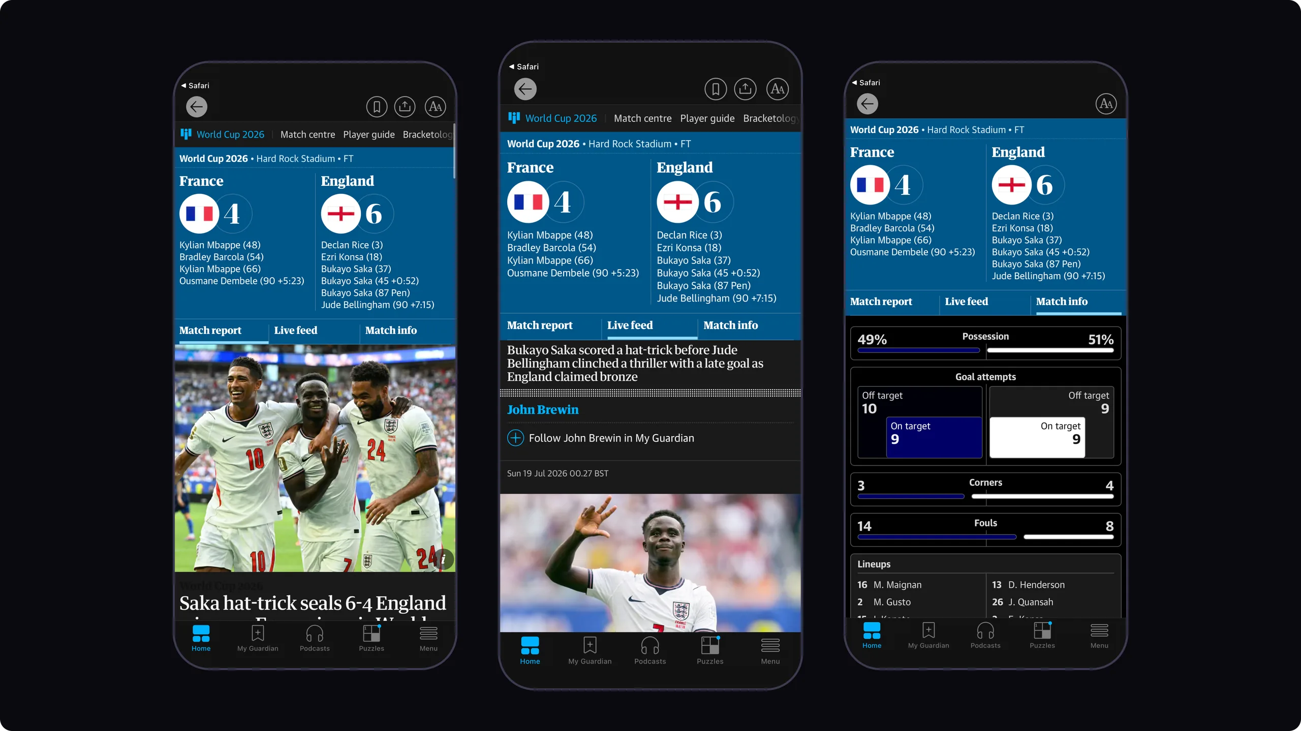
I led discovery, competitive analysis, workshop facilitation, UX strategy, information architecture, flows and wireframing, partnering with Product, Engineering and Editorial Design from exploration through delivery.
Context
When I joined the Web Experience team, I inherited an abandoned project.
The original brief was to bring the app and web live sports blogs back in line, because they'd drifted apart. A rendering platform migration was also underway, creating an opportunity to rethink the experience rather than simply address inconsistencies.
Before getting into the differences between platforms, I wanted to understand the experience of following a match from a reader's perspective and identify where the bigger problems were, rather than treating this as a visual consistency exercise.
What I found
I followed several live football matches end to end, on both app and web. The platform differences were real, but they weren't the biggest problem. The whole match-day journey had gaps.
Pre-match
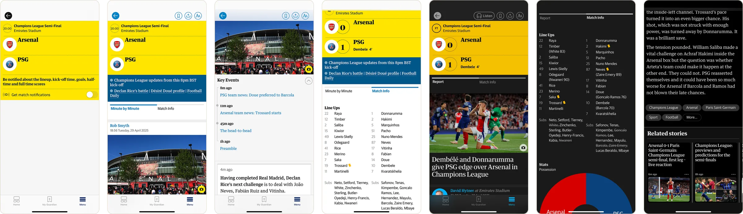
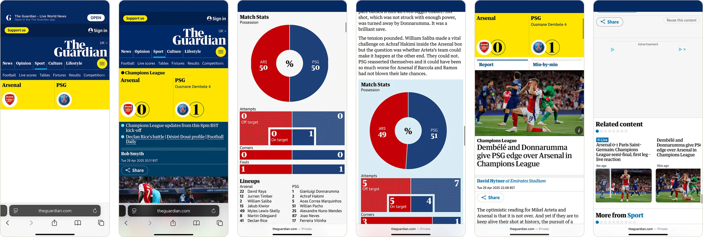
Users had little reason to engage before kick-off.
Readers had no reason to arrive early, and could go elsewhere for team news before kick-off.
During the match
Users could lose track of which fixture they were viewing.
Following a match took more effort than it should, at the moments readers cared about most.
Across the journey
The journey didn't adapt naturally as a match progressed.
After full time, stats were repeated in the match report and the minute-by-minute tab, and the report was sometimes dropped into the end of the live feed, so readers didn't know where to look.
The experience before · App
The experience before · Web
The reframe
These findings shifted the direction of the project.
Rather than solving a visual consistency issue between platforms, I suggested we rethink the entire match-day experience as one connected journey: before, during and after the game.
Research
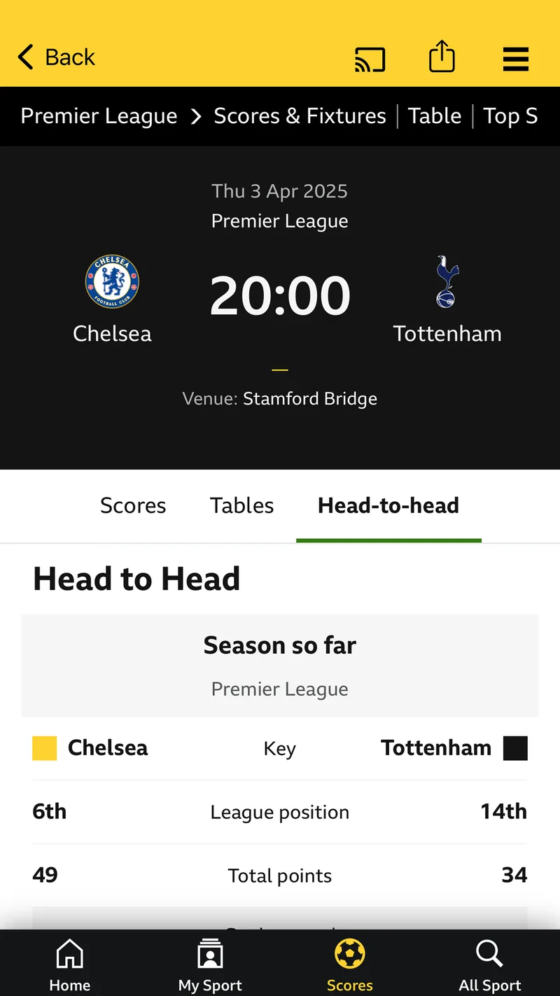
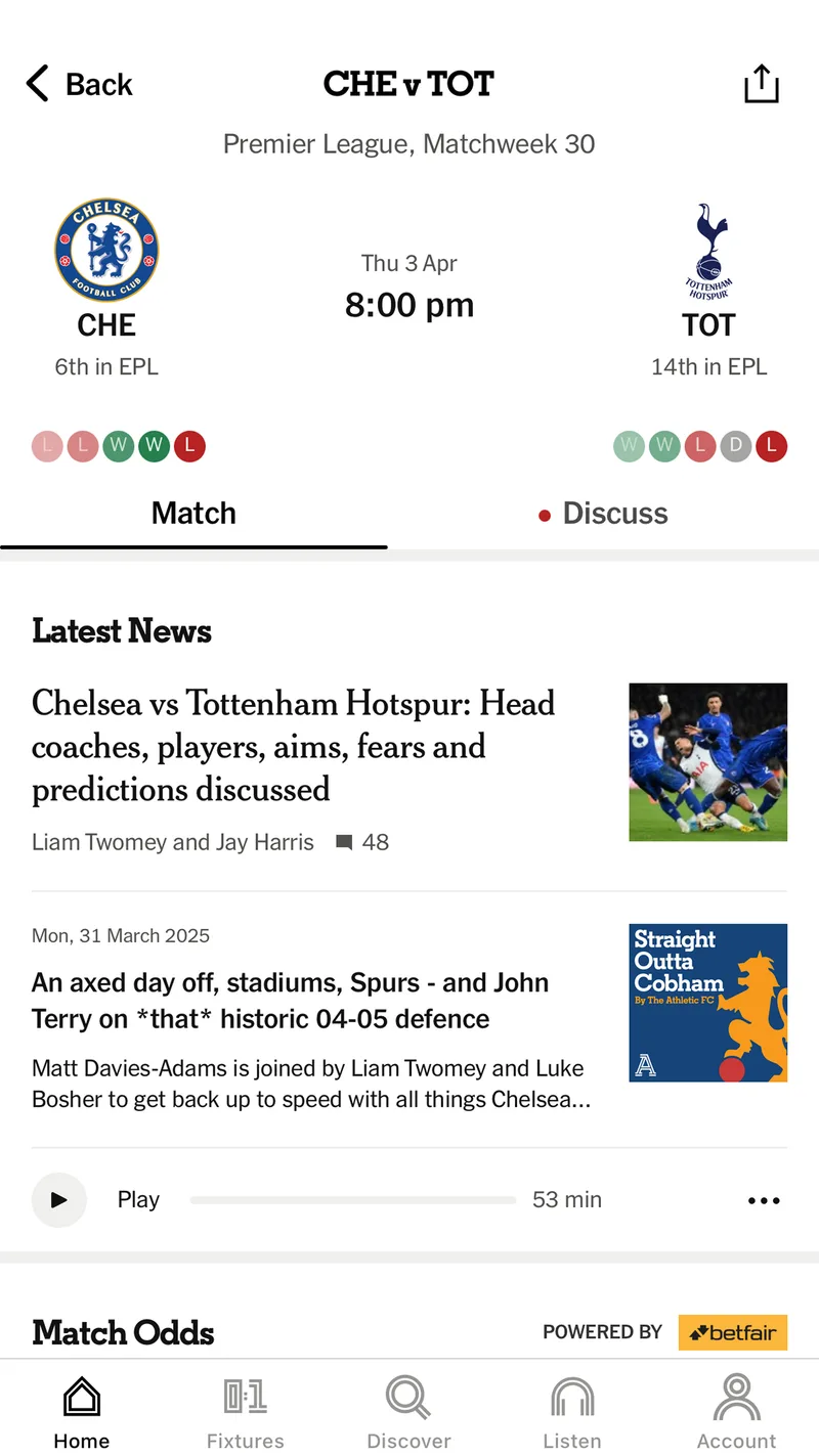
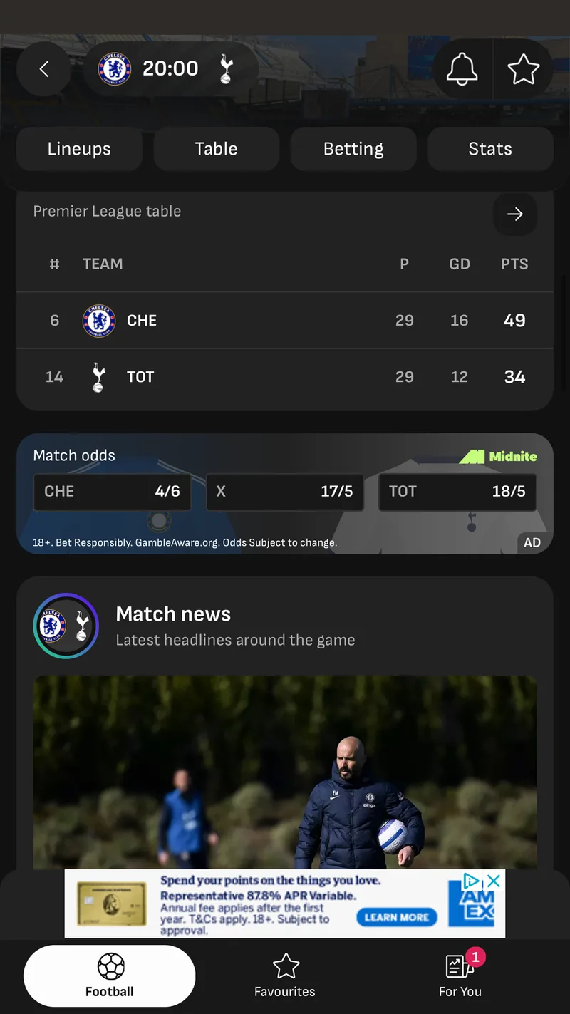
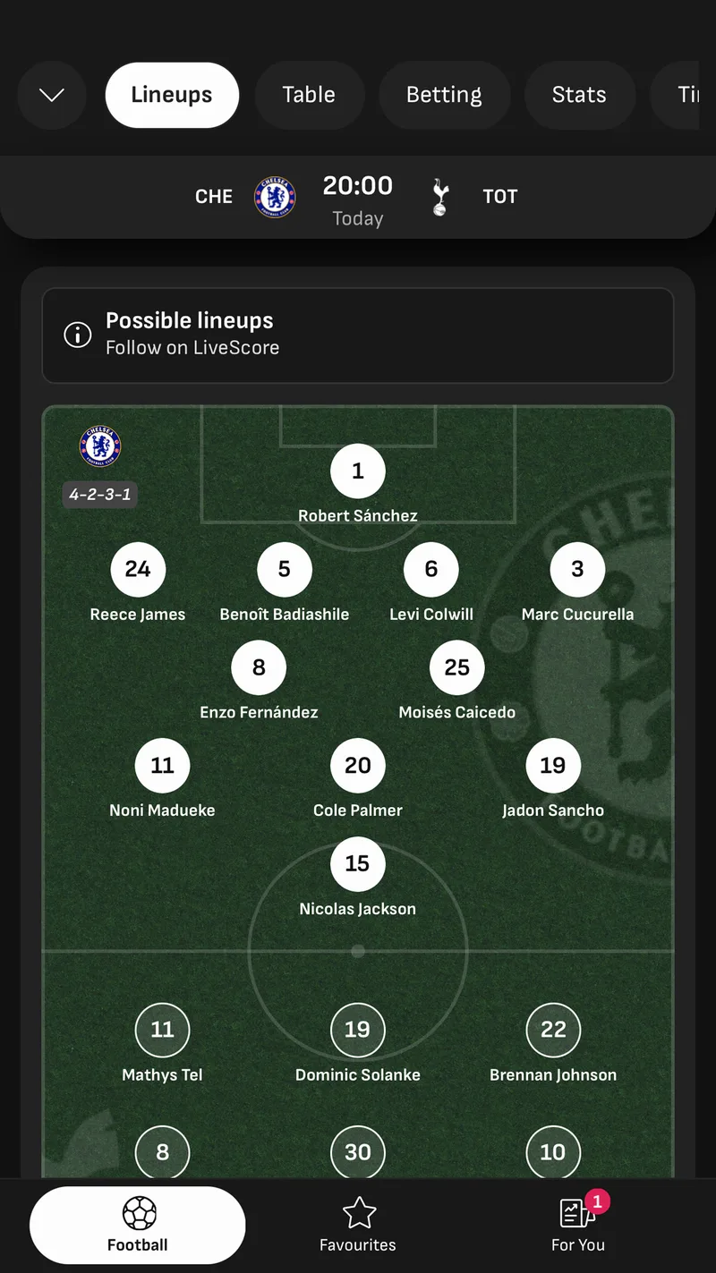
I reviewed how other news and sports platforms handled different stages of the match-day journey, from pre-match through to the final whistle and beyond. I also spoke with football fans internally to understand what information and context they valued at different moments.
These patterns helped shape the direction and prioritise the MVP with the Product Manager.
Ideation
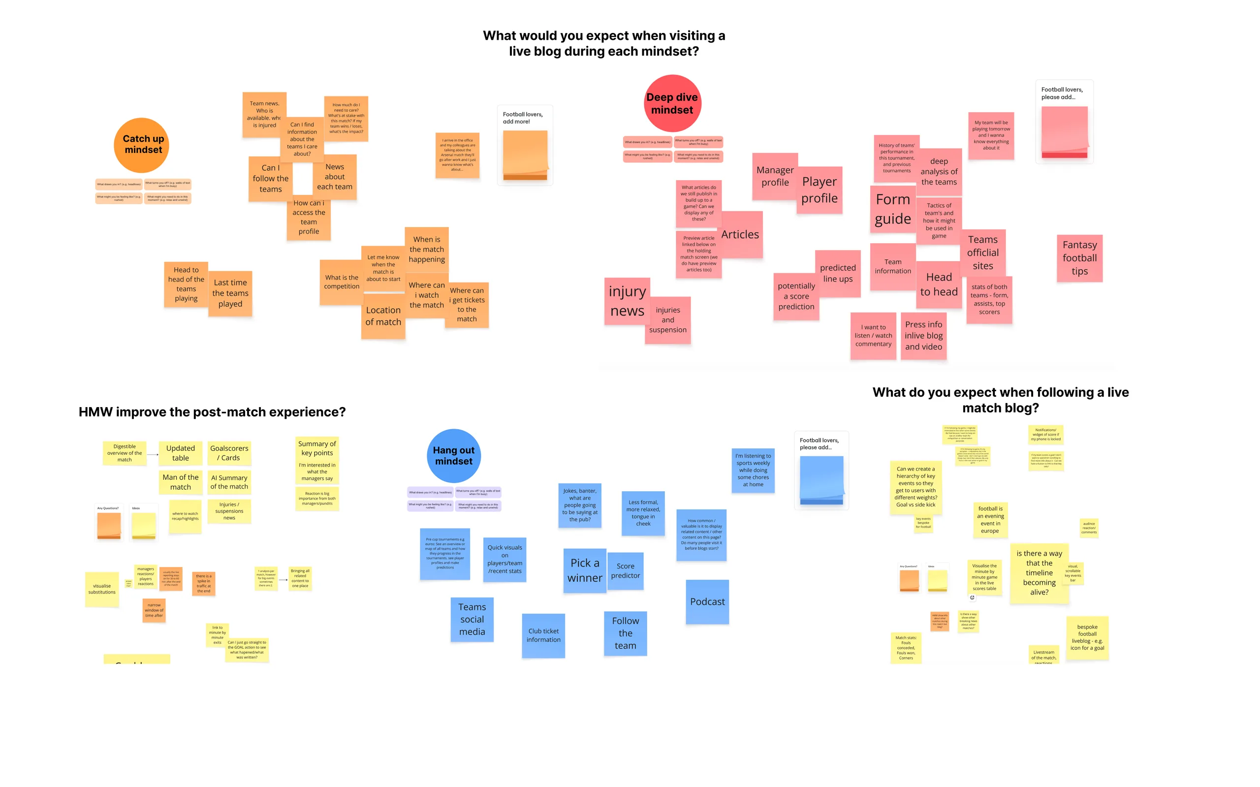
To turn what I'd found into ideas, I planned and led an ideation workshop with the team, football fans from across the company and editorial stakeholders. We worked through each stage of match day (before, during and after the game) and generated ideas for how we could improve it.
Bringing editorial into the room early meant the ideas were grounded in how live coverage actually works, and it gave the people who'd be producing the content a say in the direction from the start.
Key decisions
From the workshop, the PM and I narrowed the ideas down to three priorities for the MVP.
Give users a reason to engage before kick-off through related articles and team news.
Maintain fixture context throughout the journey from fixtures to live match pages.
Make reports, commentary and stats easier to discover after the match.
Designing the experience
I defined the flows, structure and wireframes, then partnered with the Editorial Design team on the visual design.
My ideas also included articles about both teams alongside other relevant coverage before kick-off, and a dedicated line-up tab showing the starting line-up and substitutes, possibly on a pitch map.
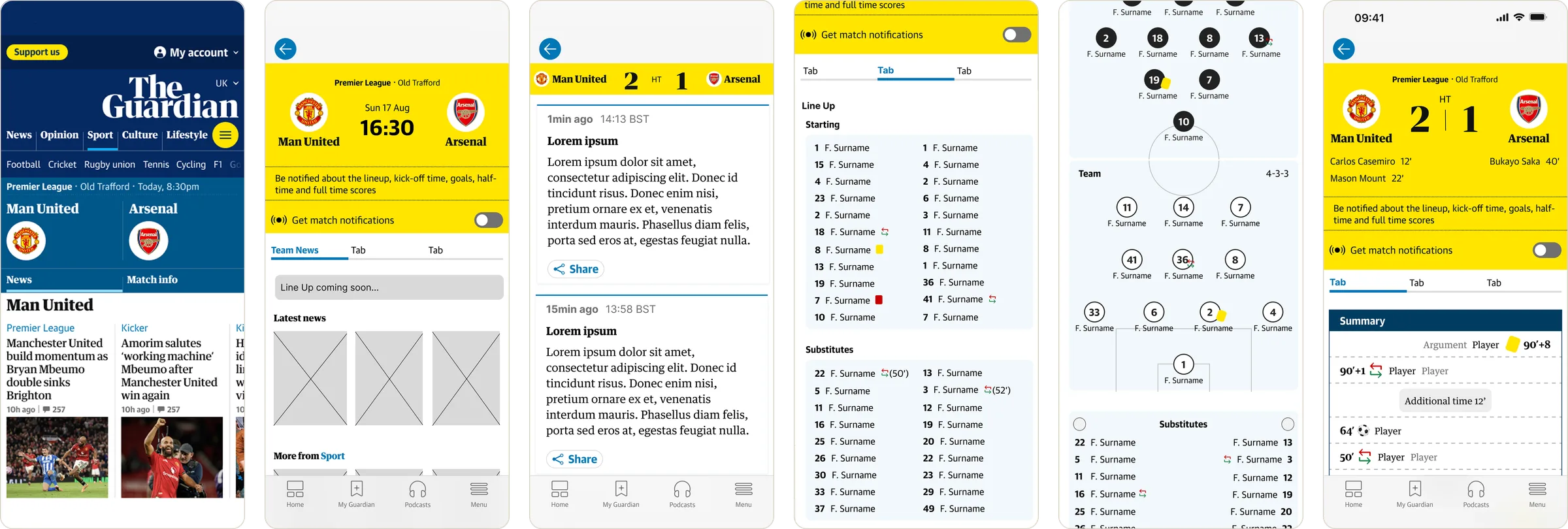
The pre-match scoreboard clearly shows the match info, with a placeholder for the line-up, so the page has something to offer before the live blog starts.
Each team name links to its team page, listing all of that team's latest news.
For example, the Live Feed shows during play and the Match Report appears once it's published.
Fixture details and line-ups are clearer.
Yellow and red cards stand out, and substitutions show who came on and when, with a timestamp.
Outcome
The redesign turned a fragmented match-day journey into a connected experience that could evolve from pre-match through live coverage and into post-match.
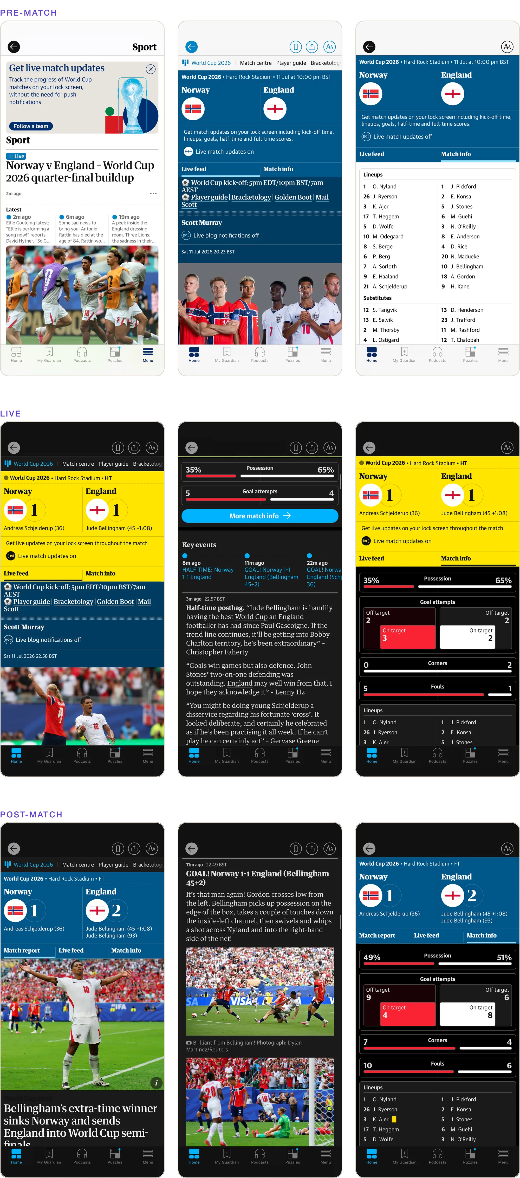
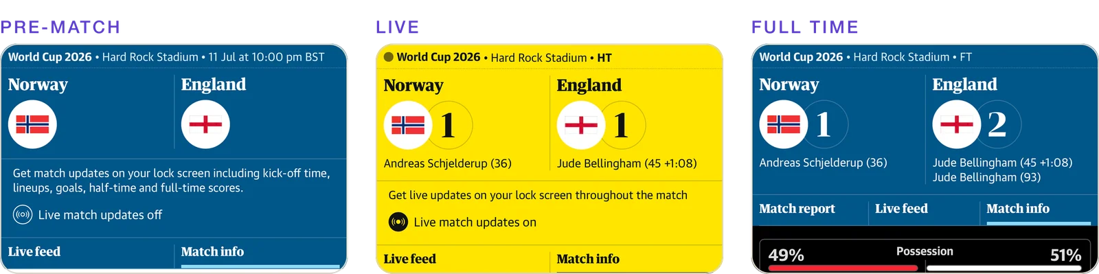
The first release launched ahead of the World Cup, with football establishing the initial patterns for a broader live sports experience. The approach was later extended to cricket and rugby coverage.
Reflection
Once I looked at the whole match-day experience, it was clear there were gaps, and some quick fixes that could make a real difference for readers and keep them coming back to the Guardian instead of going to competitors.
Looking back, the biggest lesson for me was that a narrow brief can hide a much bigger opportunity. I could easily have taken the existing work and made a few changes. Instead, I took a step back, reviewed the whole experience and looked at competitors. Putting that evidence side by side is what changed the conversation with the PM, and showed that what happens before the live blog starts matters just as much as the live coverage.